One additional concern that we must deal with when plotting within-subjects data is the error bars. Plotting the standard error or regular confidence intervals may give a misleading representation of the variation of scores in each condition. This is because the values when normally calculated do not account for within subject correlation. How to address this has been the cause of some debate, see Cousineau (2005) and Morey (2008).
We’ll walk through how do deal with this issue in this walkthrough.
First, let’s grab the packages and data from the last walkthrough:
pacman::p_load(data.table, tidyverse, rstatix, cowplot, performance, emmeans, afex, see )example_data <-read_csv("http://tehrandav.is/courses/statistics/practice_datasets/withinEx2.csv")
Rows: 36 Columns: 3
── Column specification ────────────────────────────────────────────────────────
Delimiter: ","
chr (1): Lecture
dbl (2): Subject, Score

ℹ Use `spec()` to retrieve the full column specification for this data.
ℹ Specify the column types or set `show_col_types = FALSE` to quiet this message.
If you are presenting a simple repeated measures design (e.g., very very factors × levels) then my general recommendation is to combine the (uncorrected) mean and 95% CI error bars with a violin plot or a rain cloud plot.
For now, let’s just plot the means and standard error bars and add some nice violin plots:
That said, a slightly more involved method would be to to “correct” the standard error bars using a methods described by Cousineau (2005) and Morey (2008).
47.2.1 What’s going on here?!?!?
Here, I’m simply presenting the practical steps for this correction. I don’t expect you to do this “by hand” but just want to give you a feel for what’s involved. This process begins with norming the data to account for within subjects correlations. This is done by dividing each score by the standard deviation of that participant’s scores. This is done using the normDataWithin function in the Rmisc package.
   Subject  Lecture Score ScoreNormed
1        1 Physical    53    38.16667
2        1  History    45    30.16667
3        1   Social    47    32.16667
4       10 Physical    18    35.16667
5       10   Social    10    27.16667
6       10  History    21    38.16667
7       11 Physical    32    41.16667
8       11   Social    11    20.16667
9       11  History    30    39.16667
10      12   Social     6    21.83333
11      12 Physical    27    42.83333
12      12  History    20    35.83333
13       2 Physical    49    38.50000
14       2   Social    42    31.50000
15       2  History    41    30.50000
16       3 Physical    47    39.16667
17       3   Social    39    31.16667
18       3  History    38    30.16667
19       4 Physical    42    37.16667
20       4   Social    37    32.16667
21       4  History    36    31.16667
22       5 Physical    51    41.83333
23       5   Social    42    32.83333
24       5  History    35    25.83333
25       6 Physical    34    34.16667
26       6   Social    33    33.16667
27       6  History    33    33.16667
28       7 Physical    44    43.16667
29       7   Social    13    12.16667
30       7  History    46    45.16667
31       8 Physical    48    46.83333
32       8   Social    16    14.83333
33       8  History    40    38.83333
34       9 Physical    35    41.83333
35       9   Social    16    22.83333
36       9  History    29    35.83333
We then calculate the se, sd, and ci values of our normed data, in this case ScoreNormed in table above.
The final step is to make a correction on these Normed values (Morey (2008). This is done by taking the number of levels of the within factor (nWithinGroups) and applying the following correction:
# get the number of levels in Lecture:nWithinGroups <-nlevels(example_data$Lecture)# apply the correction factor:correctionFactor <-sqrt(nWithinGroups/(nWithinGroups -1))
The range of our corrected errorbars are the sd, se, ci multiplied by this correctionFactor.
For example, the sd of participants’ Score in Physical is:
Fortunately there is a function in Rmisc that handles this correction for us, summarySEwithin. It is very similar to the summarySE function you are familiar with, but asks you to specify which IVs are within-subjects (withinvars), between-subjects(betweenvars) and which column contains subject IDs idvar. Using our original example_data data:
   Lecture  N Score       sd       se       ci
1  History 12  34.5 6.531973 1.885618 4.150217
2 Physical 12  40.0 4.439833 1.281670 2.820936
3   Social 12  26.0 9.119576 2.632595 5.794302
Unfortunately, to date I haven’t found a way to get this to play nice with stat_summary() in ggplot(). HOWEVER, there is a simple work around. Since stat_summary() is simply summarizing our means and error values from the dataset and summarySEwithin is doing the exact same thing, we can simply pull these values straight from summarySEwithin.
However, before we go off using summarySEwithin there is still one more issue—summarySEwithin reports the normed means and errors. For plotting, however, we need the original means. Note that this is not an issue when you are only dealing with within subjects factors like this week, but if you are performing mixed ANOVA (combination within-subjects and between-subjects) these means can differ from one another.
To address this problem user Hause Lin created a custom function summarySEwithin2 that reports both normed and unnormed means. You can find this script on their Github site here. I would recommend copying and pasting the code you your own “.R” file for future use. In the meantime we can directly source this code from their site:
A similar script may be found on this ggplot tutorial site, which forms the basis of this alternative plotting method.
47.2.2 Plotting the with corrected bars
Given the discussion above, we can plot with the corrected error bars. Let’s first create a plot_table that contains the means and corrected values using summaryWEwithin2
   Lecture  N Score ScoreNormed       sd       se       ci
1  History 12  34.5        34.5 6.531973 1.885618 4.150217
2 Physical 12  40.0        40.0 4.439833 1.281670 2.820936
3   Social 12  26.0        26.0 9.119576 2.632595 5.794302
From here we can construct our ggplot using the summary table that we created, plot_table.
p <-ggplot(plot_table, # using the corrected table to make the plotsaes(x = Lecture, # plot_table Lecture on the x-axis,y = Score, # plot_table Score on the y-axis group=1# necessary for constructing line plots ) )
For this method, rather than using summary_stat() we directly call each geom. For example, adding the means and as points:
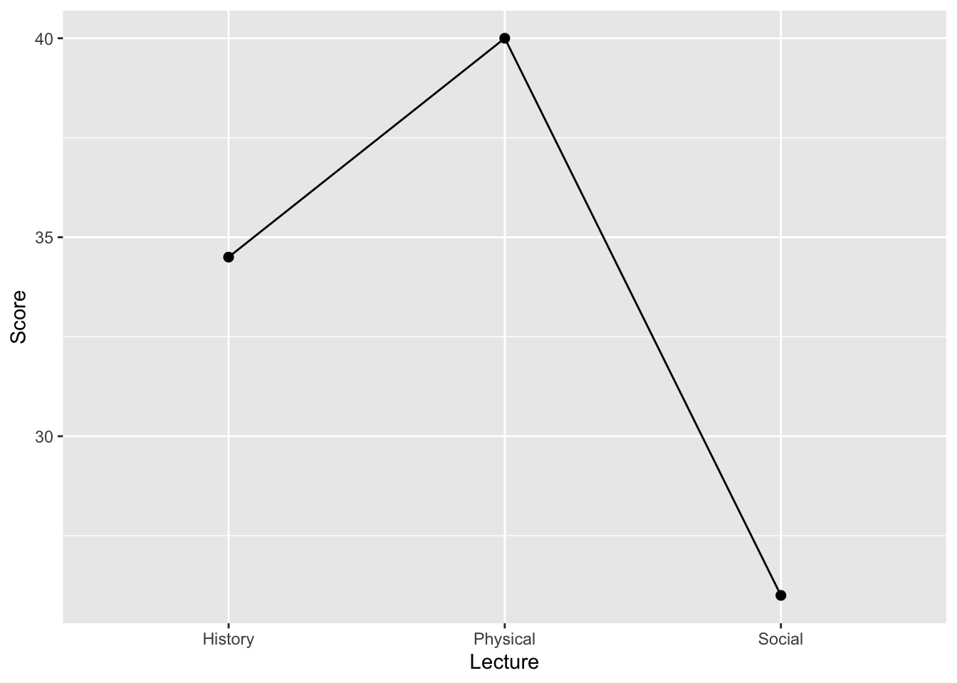
p <- p +geom_point(size =2)p
Connecting those points with lines:
p <- p +geom_line()p
Adding error bars (SE):
p <- p +geom_errorbar(aes(ymin=Score-se, ymax=Score+se), width=0)show(p)
note that above I set width of the error bars to 0 to keep consistent with how we’ve been plotting pointranges. However, if you want caps, you can change the width. I recommend a width no higher than 0.2.
This is what it would look like all in one fell swoop.
   Lecture  N Score ScoreNormed       sd       se       ci
1  History 12  34.5        34.5 6.531973 1.885618 4.150217
2 Physical 12  40.0        40.0 4.439833 1.281670 2.820936
3   Social 12  26.0        26.0 9.119576 2.632595 5.794302
ggplot(plot_table, # using the corrected table to make the plotsaes(x = Lecture,y = Score, group=1)) +geom_point(size =2) +geom_errorbar(aes(ymin=Score-se, ymax=Score+se), width=0) +geom_line() +theme_cowplot()
47.3 Comparing the outcomes
For reference, here are the corrected error bars (dark blue) next the uncorrected values (orange). As you can see in this case the correction reduced the size of the error bars. This facilitates better interpretation for anyone looking to gleam mean differences from the plots.
ggplot(plot_table, # using the corrected table to make the plotsaes(x = Lecture,y = Score, group=1)) +geom_point(size =2, color ="darkblue") +geom_errorbar(aes(ymin=Score-se, ymax=Score+se), width=0, color ="darkblue") +stat_summary(data = example_data, mapping =aes(x = Lecture, y = Score), fun.data ="mean_se", position = ggpp::position_dodgenudge(x = .1),color ="darkorange" ) +theme_cowplot()