In this walkthrough, we’re diving a little bit deeper into the the normal distribution, a theoretical distribution that you’ve probably heard of before. It is sometimes referred to as the Gaussian distribution and is characterized by its bell-shaped curve. Understanding the normal distribution is essential for anyone involved in psychological research, and in this walkthrough, we’ll explore why it holds such significance.
Just as we’ve classified distributions into the population, sample, and theoretical types, the normal distribution falls into the realm of theoretical distributions. It is an idealized distribution that, despite not being perfectly representative of real-world data, serves as an incredibly useful model for understanding the nature and properties of data in psychology.
15.1 The Equation
For those who are mathematically inclined, the normal distribution is mathematically defined by two parameters—its mean (µ) and its standard deviation (σ).:
\(\sigma\) is the standard deviation of the distribution.
\(\sigma^2\) is the variance of the distribution.
\(e\) is the base of the natural logarithm (approximately equal to 2.71828).
The equation describes the characteristic “bell-shaped” curve of the normal distribution. The peak of the curve is at the mean \(\mu\), and the width of the bell is determined by the standard deviation \(\sigma\). The factor \(\frac{1}{\sigma \sqrt{2\pi}}\) ensures that the total area under the curve is equal to 1, which is a property of probability density functions.
15.2 Plotting the Gaussian Distribution in R
To get a good sense of what the normal distribution looks like, let’s plot it using ggplot.
pacman::p_load(tidyverse, cowplot)# Generate a sequence of x valuesx_vals <-seq(-4, 4, by =0.1)# Compute the density of the normal distribution for these x valuesy_vals <-dnorm(x_vals)# Create a data frame for plottingdf_gaussian <-tibble(x = x_vals, y = y_vals)# Plot using ggplotggplot(df_gaussian, aes(x = x, y = y)) +geom_line() +theme_cowplot() +ggtitle("The Gaussian (Normal) Distribution")
15.3 Why the Gaussian Distribution Matters in Psychology
The relevance of the Gaussian distribution in psychology can be understood through the lens of the following key points:
Measurement Error: Psychological attributes often involve measurement error. When errors are random and originate from multiple sources, their distribution tends to follow the normal curve due to the Central Limit Theorem (more on this in the next walkthough).
Population Modeling: Many psychological attributes (like IQ, personality traits, etc.) are approximately normally distributed in the general population, making the Gaussian model a good theoretical approximation.
Statistical Testing: Many parametric tests in psychology, like t-tests and ANOVAs, rely on the assumption of normality for making accurate inferences.
Ease of Computation: The properties of the normal distribution simplify the mathematical treatment of data. Z-scores, for instance, are readily understood and computed when data is normally distributed.
Standardization: The concept of Z-scores and standardization is based on the properties of the normal distribution. This allows researchers to compare scores from different distributions and different scales, aiding in the synthesis of research findings across different psychological constructs.
The probability density function of this curve is well-known. The Empirical Rule, or better the 68-95-99.7 rule, often is a quick, easy-to-remember shorthand for understanding the characteristics of a normal distribution. According to this rule:
About 68% of the data in a normal distribution falls within one standard deviation \(\sigma\)) of the mean \(\mu\)).
About 95% falls within two standard deviations.
About 99.7% falls within three standard deviations.
This rule provides a simple way to understand and visualize the distribution of scores and to identify what is “typical” or “unusual” within a given dataset that approximates a normal distribution. For instance, if you have a mean score of 100 with a standard deviation of 15, you can quickly infer that about 68% of the scores lie between 85 and 115, about 95% between 70 and 130, and about 99.7% between 55 and 145.
15.4 A Practical Example: IQ Scores
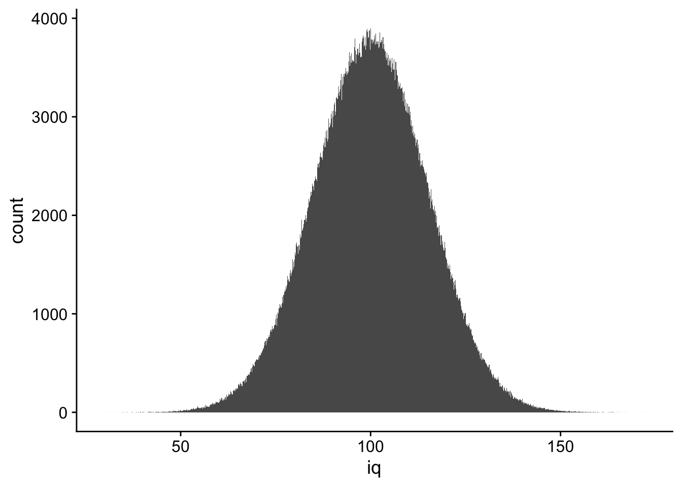
Let’s assume that IQ scores are normally distributed in the general population with a mean of 100 and a standard deviation of 15. We can simulate this in R just like we did for men’s heights in the previous walkthrough The chunk below creates the distribution, creates a tibble() for this data, and plots it using ggplot.
# Generate a sample of IQ scores for a simulated populationset.seed(42)population_iq <-rnorm(n =1000000, mean =100, sd =15)# Convert to a tibbleperson_id <-1:1000000pop_iq_scores <-tibble(person = person_id,iq = population_iq)# Plot the distributionggplot(pop_iq_scores, aes(x = iq)) +geom_histogram(bins =sqrt(1000000)) +theme_cowplot()
15.5 Summary Statistics for IQ Scores
Let’s take a look at the summary statistics for our simulated population of IQ scores.
       vars     n      mean        sd    median   trimmed       mad   min
person    1 1e+06 500000.50 288675.28 500000.50 500000.50 370650.00  1.00
iq        2 1e+06    100.01     15.02    100.02    100.01     15.02 29.82
             max     range skew kurtosis     se
person 1000000.0 999999.00    0     -1.2 288.68
iq         172.3    142.48    0      0.0   0.02
I want to point out a few things related to this output given we understand our iq data closely approximating a normal distribution.
the mean (100.01) nd median (100.02) are nearly identical
the skew is 0
the kurtosis is 0
The mean and median are nearly identical because the distribution is symmetric. The skew and kurtosis are both 0 because the distribution is approximately normal.
15.6 The Central limit theorm
The central limit theorem states that the sampling distribution of the mean of any independent, random variable will be normal or nearly normal (more on this in the next walkthrough), if the sample size is large enough. How large is large enough? The answer depends on two factors: 1) the shape of the underlying population and 2) the sample size. The theorem is important because it allows us to make inferences about a population from a sample drawn from that population. More, it allows us to make inferences about a population from a sample that is not normally distributed. This provides the theoretical basis for many statistical procedures used in psychological research.
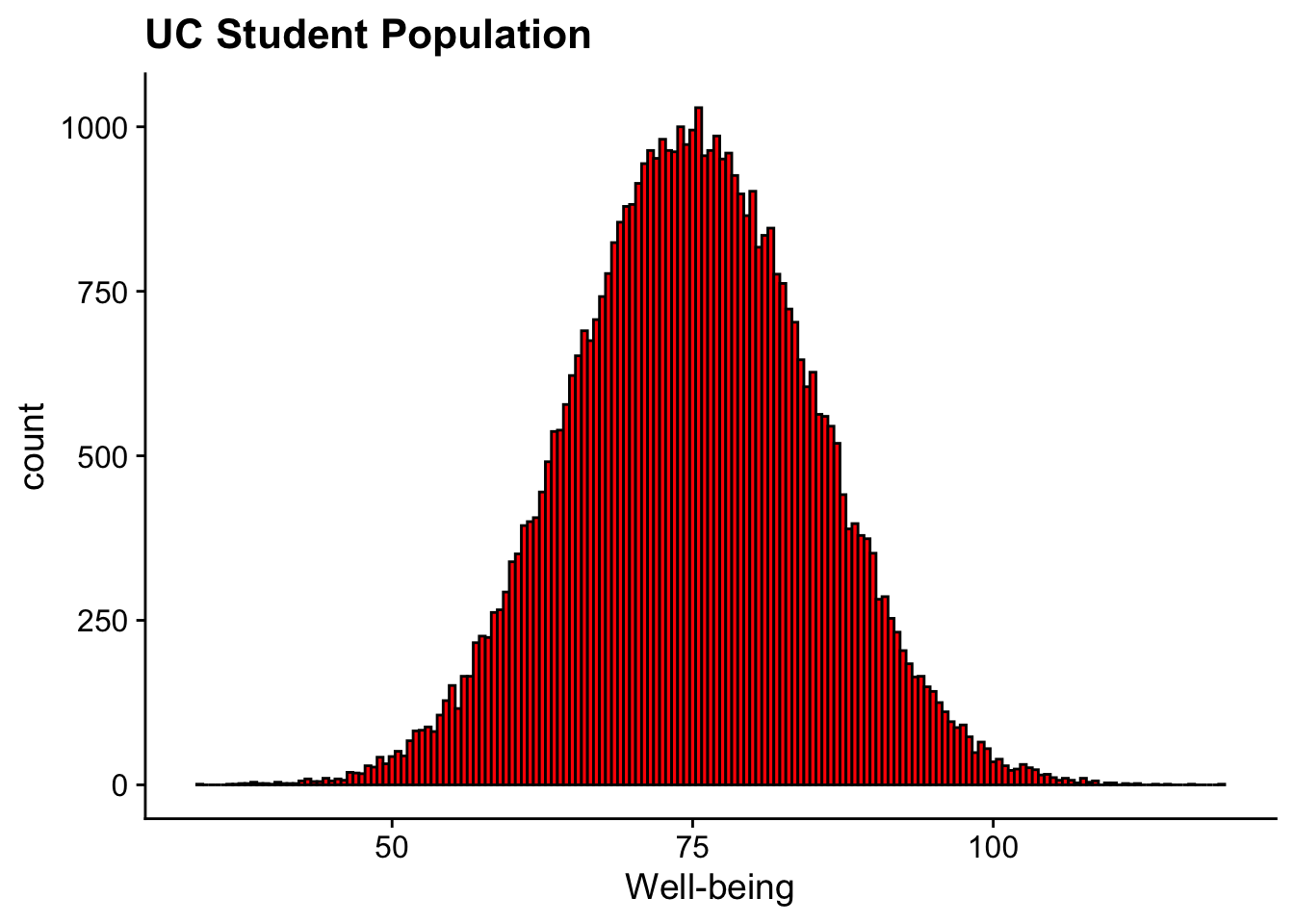
Let’s create a hypothetical sampling distribution of means. In this case we’ll start with our 50,000 strong population of students here at UC (Go Bearcats!). Let’s imagine that we are obtaining Well-Being scores for each student, we this is a composite score that quantifies students’ perceived quality of life, life satisfaction, and psychological health. The score is derived from a validated questionnaire administered to students at the beginning of the semester.
Rows: 50000 Columns: 2
── Column specification ────────────────────────────────────────────────────────
Delimiter: ","
chr (1): student_ids
dbl (1): well_being_scores

ℹ Use `spec()` to retrieve the full column specification for this data.
ℹ Specify the column types or set `show_col_types = FALSE` to quiet this message.
                  vars     n     mean       sd   median  trimmed     mad   min
student_ids*         1 50000 25000.50 14433.90 25000.50 25000.50 18532.5  1.00
well_being_scores    2 50000    75.01     9.99    74.96    74.99    10.0 34.19
                       max    range skew kurtosis    se
student_ids*      50000.00 49999.00 0.00    -1.20 64.55
well_being_scores   118.77    84.58 0.02    -0.01  0.04
and create a histogram:
ggplot(uc_wellbeing_df, aes(x = well_being_scores)) +geom_histogram(binwidth =0.5, fill ="red", color ="black") +labs(title ="UC Student Population", x ="Well-being") +theme_cowplot()
15.6.2 pulling samples from the population
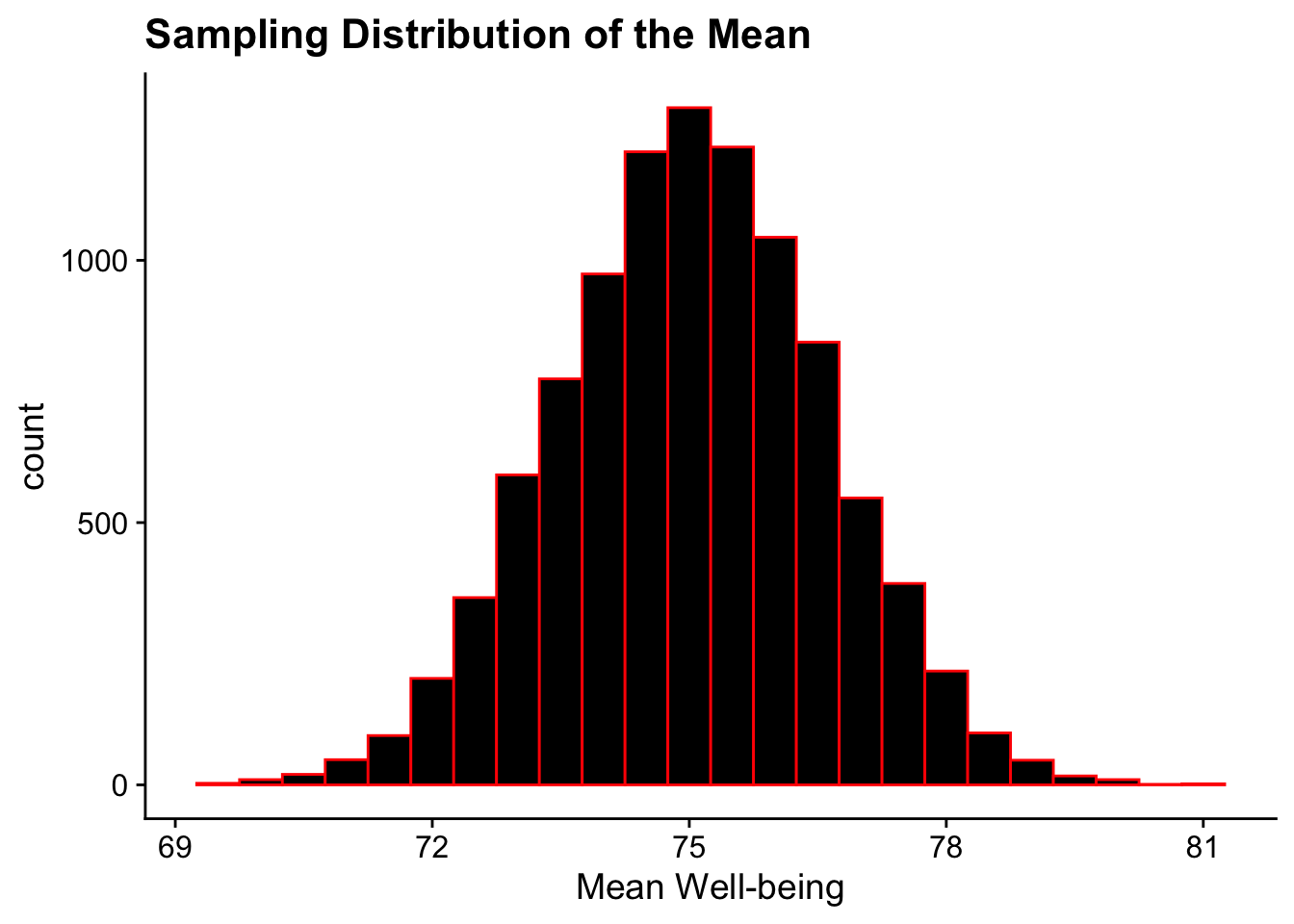
Now let’s create a sampling distribution of means by:
pulling 40 students at random
getting that sample mean
repeating steps 1 & 2 10,000x
sample_means <-vector("double", 10000) # Create an empty vector to store resultsfor(sample_number in1:10000) { sample_data <-sample(uc_wellbeing_df$well_being_scores, 40, replace = T) # Sampling with replacement sample_means[sample_number] <-mean(sample_data)}# Visualizing the sampling distribution of the meanggplot(NULL, aes(x = sample_means)) +geom_histogram(binwidth =0.5, fill ="black", color ="red") +labs(title ="Sampling Distribution of the Mean", x ="Mean Well-being") +theme_cowplot()
The resulting sampling distribution is normal.
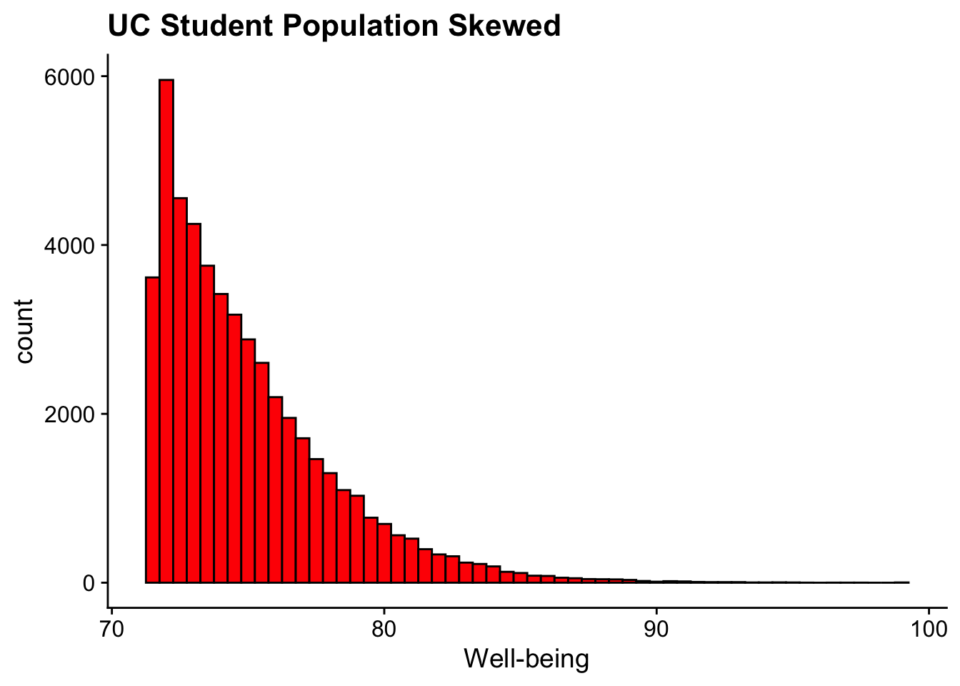
15.6.3 non-normal population distributions
In the example above the overall population distribution was normal. Let’s consider a scenario where that is not the case. Let’s imagine instead the population-level well-being scores were positively-skewed. To do this we’ll add a column of skewed scores to our original data frame using mutate and a fuction from the SimDesign package (don’t worry, you don’t need to know the details of the SimDesign package):
ggplot(uc_wellbeing_df, aes(x = skewed_scores)) +geom_histogram(binwidth =0.5, fill ="red", color ="black") +labs(title ="UC Student Population Skewed", x ="Well-being") +theme_cowplot()
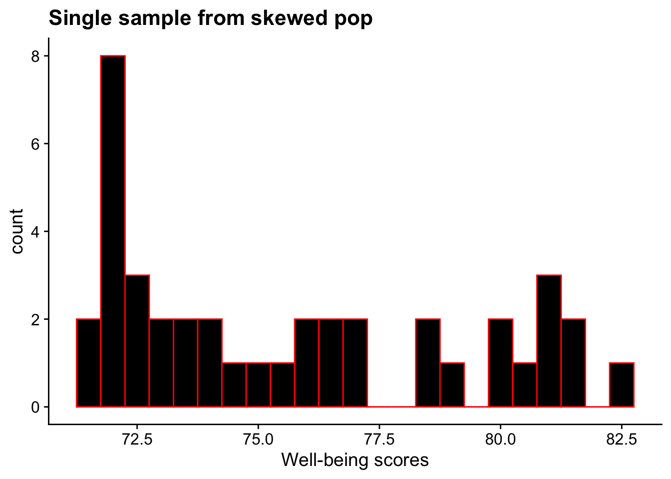
If we grab any single sample, we’ll likely find that it is also skewed:
skewed_sample <-sample(uc_wellbeing_df$skewed_scores, 40)ggplot(NULL, aes(x = skewed_sample)) +geom_histogram(binwidth =0.5, fill ="black", color ="red") +labs(title ="Single sample from skewed pop", x ="Well-being scores") +theme_cowplot()
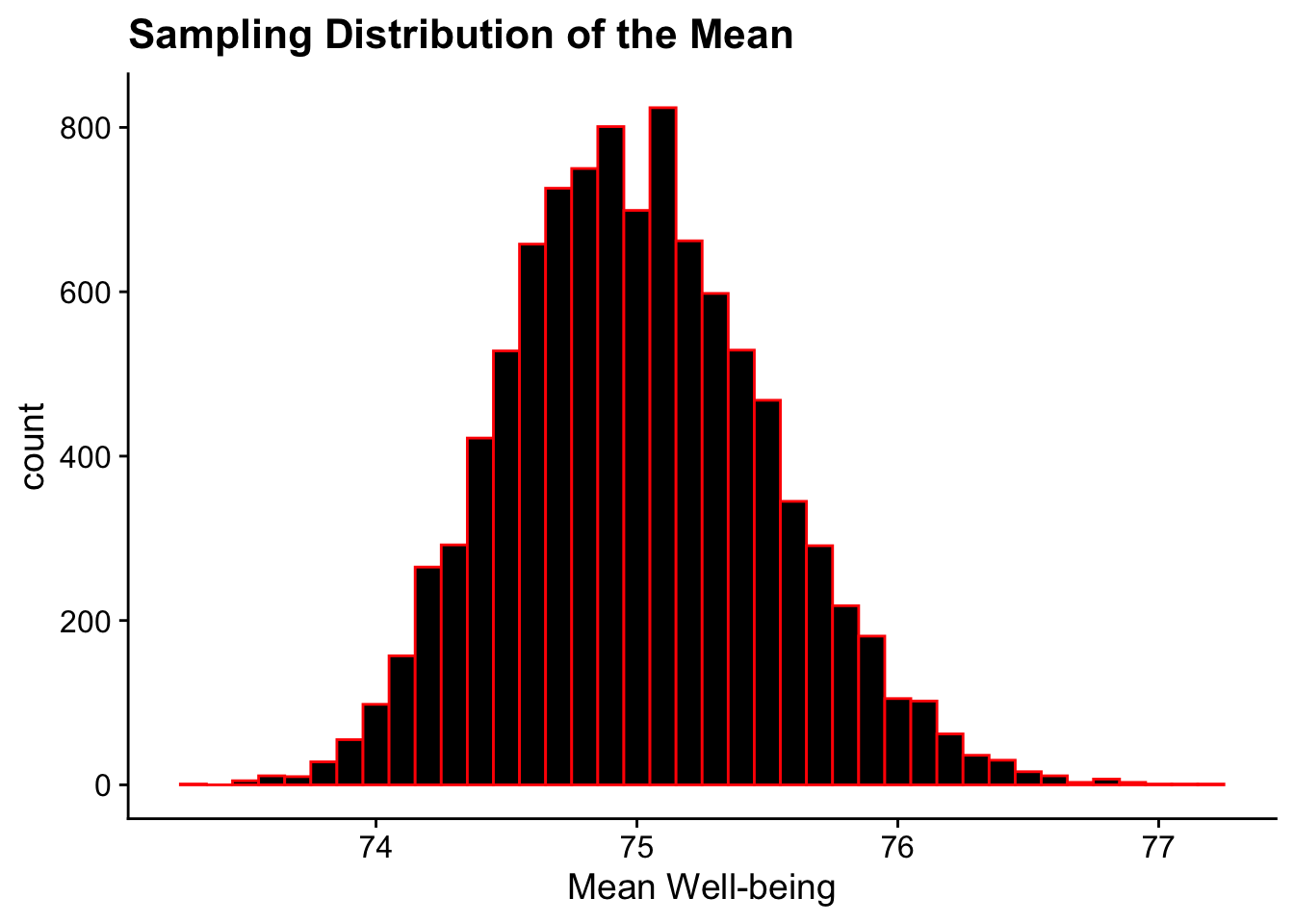
However, take a look at what happends when we run create a sampling distribution of means from this skewed population:
sample_means <-vector("double", 10000) # Create an empty vector to store resultsfor(sample_number in1:10000) { sample_data <-sample(uc_wellbeing_df$skewed_scores, 40, replace = T) # Sampling with replacement sample_means[sample_number] <-mean(sample_data)}# Visualizing the sampling distribution of the meanggplot(NULL, aes(x = sample_means)) +geom_histogram(binwidth =0.1, fill ="black", color ="red") +labs(title ="Sampling Distribution of the Mean", x ="Mean Well-being") +theme_cowplot()