pacman::p_load(tidyverse, cowplot, pander)28 Thinking about nothing (aka the null)
On thing that was hinted at earlier in the semester is that even though we cover several different tests this semester, with different names, and seemingly different esoteric rules, they are all in fact, “just a linear model”. Before we jump into an example how this relates to the \(t\)-test for independent samples, I want to build up a few intuitions about the null and alternate hypotheses for this test. We’ll introduce a contrast between group means and the grand mean, that will pay off for us in the next walkthrough when we talk about the modeling. First the packages:
In the most general terms, an independent samples \(t\)-test compares the difference between means between a control group and an experimental group. The research hypothesis is typically that members of each of these two groups are qualitatively different from one another in a way that captured quantitatively. For example, referring to the stereotype threat study from the previous walkthrough, or theoretical position is that individuals under stereotype threat are different from controls in a way that we can index through their scores. The null hypothesis is that these two groups, and consequently their scores are not different from one another.
There are two ways to state the null hypothesis. Both end up being equivalent mathematically:
- \(H_0\): Members from the Control group and the Threat group were, in fact drawn from the same population.
- \(H_0\): The mean score from the Control group is equal to the mean score of the Threat group.
The second is how we typically see the null hypothesis expressed mathematically. However, (statement 2) is a consequence of (statement 1). That is, if members of the two groups are really, in fact, from the same population then their distributions of scores should be as if we drew two random samples from that population.
28.1 The example of an \(H_0\) distribution
As an example, let’s imagine the we have the population ohio_population of 10 million people (10e06 in scientific notation, or a 10 followed by 6 zeroes) with a true mean score of 50 and a standard deviation of 5.
ohio_population_null <- rnorm(10e06, mean = 50, sd = 5)
ggplot() + aes(ohio_population_null)+ geom_histogram(binwidth=1, colour="black", fill="grey") + theme_cowplot()
Now let’s say I pull 100 people at random from this population and label them the Control group and and another 100 and call them the Experimental (Threat) group.
control_group <- sample(ohio_population_null, size = 100)
experimental_group <- sample(ohio_population_null, size = 100)
Taking a look at these two samples (note your numbers may be slightly different then mine due to randomness)
control_plot <- ggplot() + aes(control_group)+ geom_histogram(binwidth=1, colour="black", fill="grey") + theme_cowplot()

experimental_plot <- ggplot() + aes(experimental_group)+ geom_histogram(binwidth=1, colour="black", fill="grey") + theme_cowplot()

plot_grid(control_plot, experimental_plot)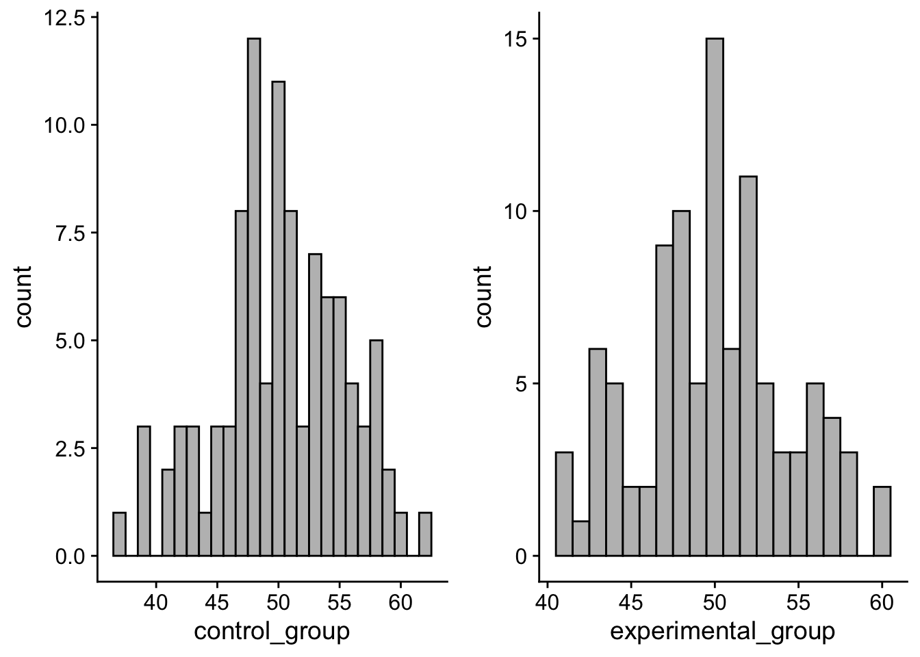
mean(control_group)[1] 50.2006mean(experimental_group)[1] 49.93744mean(control_group) - mean(experimental_group)[1] 0.2631676Pretty close to zero.
In fact, imagine that I did this 1000 times, getting the difference between my two means:
null_simulations <- tibble(simulation = 1:1000) %>%
  group_by(simulation) %>%
  mutate(control_group_mean = sample(ohio_population_null, size = 100) %>% mean(),
         experimental_group_mean = sample(ohio_population_null, size = 100) %>% mean(),
         difference_means = control_group_mean - experimental_group_mean)
null_distribution_plot <- ggplot(null_simulations) +
geom_histogram(aes(x = difference_means), binwidth=.05, colour="black", fill="grey") + theme_cowplot()
null_distribution_plot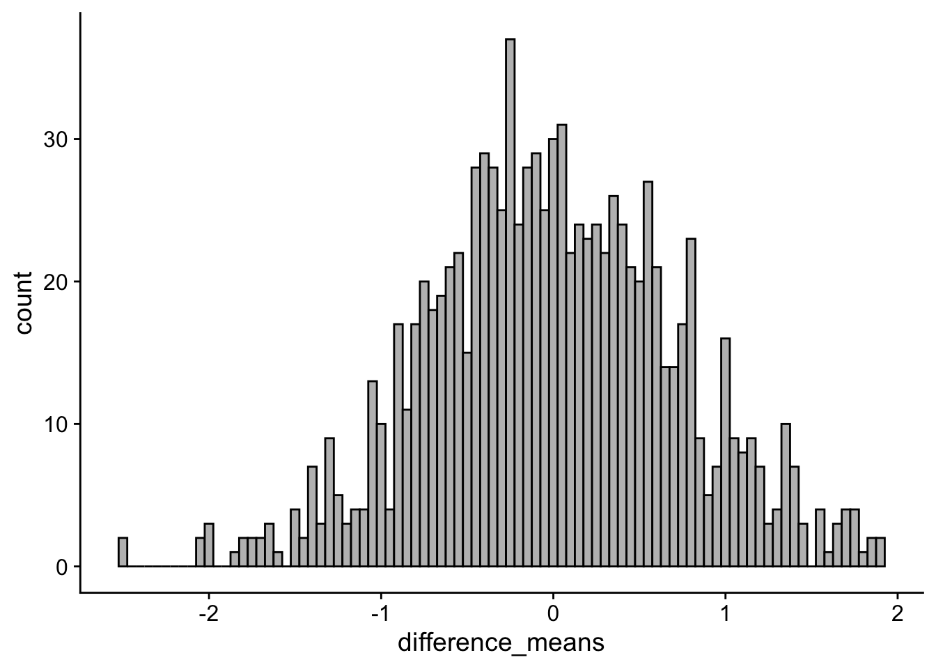
The histogram above is centered on zero. Peering deeper, the average difference between any two random samples can be expressed as:
tibble(mean_diff = mean(null_simulations$difference_means),
                        st_err_diff = sd(null_simulations$difference_means)) %>%
pander()| mean_diff | st_err_diff |
|---|---|
| -0.004718 | 0.7235 |
Thus is members of our two groups are from the same population, and there is nothing distinguishing them from one another, then there should be no difference between the means of any two random samples. FWIW, the extremes of the null_distribution give us a hint as to what mean differences have such low probability that we might consider them significant enough to reject the null hypothesis (look at the tails).
28.2 example of an \(H_1\) distribution
Now let’s imagine that 25% of my ohio_population faces stereotype threat. Typically, people facing stereotype threat (my experimental group) score about 30 points lower than those that do not. Meaning my breakdown of populations is such:
threat_pop <- rnorm(2.5e06, mean = 27.5, sd = 5)
control_pop <- rnorm(7.5e06, mean = 57.5, sd = 5)

ohio_population_alt <- c(threat_pop, control_pop)

mean(ohio_population_alt)
[1] 49.99919You’ll note here that this alternative ohio_population_alt has roughly the same mean as in the previous example (about 50), but peering in we see that the scores notatbly bimodal.
ggplot() + aes(ohio_population_alt)+ geom_histogram(binwidth=1, colour="black", fill="grey") + theme_cowplot()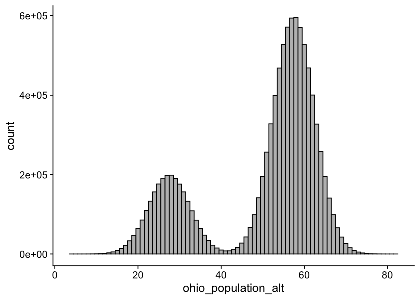
Again we can posit taking a single sample from each sub population and comparing their means
control_group_mean <- sample(control_pop, size = 100) %>% mean()
experimental_group_mean <- sample(threat_pop, size = 100) %>% mean()

control_group_mean - experimental_group_mean
[1] 29.9475And we can imagine doing this 1000 times
alt_simulations <- tibble(simulation = 1:1000) %>%
  group_by(simulation) %>%
  mutate(control_group_mean = sample(control_pop, size = 100) %>% mean(),
         experimental_group_mean = sample(threat_pop, size = 100) %>% mean(),
         difference_means = control_group_mean - experimental_group_mean)

diff_distribution_plot <- ggplot(alt_simulations) +
  geom_histogram(aes(x = difference_means), binwidth=.05, colour="black", fill="grey") + theme_cowplot()

diff_distribution_plot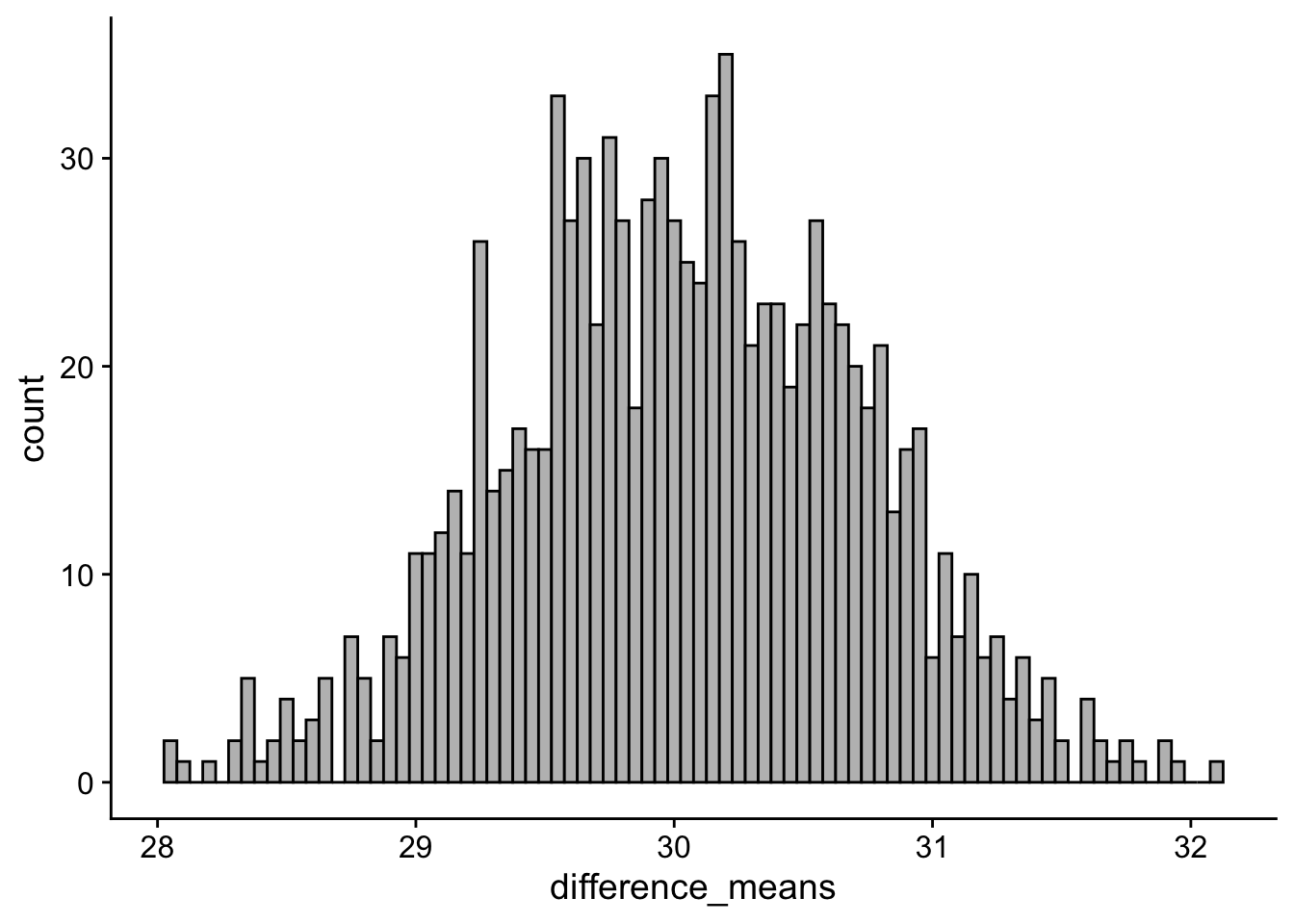
The histogram above is centered on near 30. Peering deeper, the average difference between any two random samples can be expressed as:
tibble(mean_diff = mean(alt_simulations$difference_means),
                        st_err_diff = sd(alt_simulations$difference_means)) %>%
pander()| mean_diff | st_err_diff |
|---|---|
| 30.04 | 0.6887 |
28.3 group means and grand means
In both examples, the overall grand mean of the ohio population was the same (± some random error): 50.
tibble(mean_null_pop = mean(ohio_population_null),
       mean_alt_pop = mean(ohio_population_alt)) %>%
pander()| mean_null_pop | mean_alt_pop |
|---|---|
| 50 | 50 |
However, in the first example, where the null hypothesis was indeed true, we pulled everyone from the same population… sort of like saying there really is no difference between those under threat and those that are not (control). In the second example, this was not true! In fact if we take a look at our group means from each example we see that while control and experimental are nearly identical from example 1, they are very different in example 2 (this is just reiterating what the histograms and difference scores told us above)
tibble(null_cont_mean = mean(null_simulations$control_group_mean),
       null_exp_mean = mean(null_simulations$experimental_group_mean),
       null_grand_mean = mean(ohio_population_null),
       alt_cont_mean = mean(alt_simulations$control_group_mean),
       alt_exp_mean = mean(alt_simulations$experimental_group_mean),
       alt_grand_mean = mean(ohio_population_alt)) %>%
pander()| null_cont_mean | null_exp_mean | null_grand_mean | alt_cont_mean |
|---|---|---|---|
| 50 | 50.01 | 50 | 57.49 |
| alt_exp_mean | alt_grand_mean |
|---|---|
| 27.45 | 50 |
This is that key mathematical truth that I was getting at earlier. If the null hypothesis is true, not only are the group means equal to one another, but they are also equal to the grand mean assuming both come from the same population. Put another way, if you were to look at the sample mean from the control group and the sample mean from the experimental group, the null hypothesis indicates that they should both be equal to one another. If this is the case, then it must also be true that each of the group means is equal to the grand mean you would get if you took an average of all of the scores (from both groups) combined.
If the null hypothesis is not true, then not only are the two means different from one another, but they should also be different from the grand mean. Looking to the next walkthrough, the grand mean is what factors into our null_lm_model, the model that takes the form: outcome~1, or outcome as predicted by the intercept-only. Last week, we talked about how in simple regression, this intercept represented the mean of all outcome scores (assuming no predictor). The same thing is true here… the grand mean is the mean of all outcome scores.
If you’ve made it this far, move on to the next walkthrough for the pay-off.