pacman::p_load(tidyverse, # data frames and data wrangling
               gt, # a package for making nice tables
               DescTools, # a package for getting the mode
               psych,
               cowplot # for plotting multiple plots in one figure

)10 Means and other models
First, let’s load in the packages we’ll be using for this walkthough:
A primary emphasis this semester is that statistical methods are more than simply a toolbox to be thrown at data, but instead are a theoretical framework for developing models that help us to understand the world. The term model here is no more fancy or sophisticated than the types of models you may have played with as a child. Just as children immerse themselves in the world of model airplanes or dollhouses, understanding that these are simpler, scaled-down versions of the real thing, statistical models are representations of more complex systems. A few years ago, my then four-year-old daughter became fascinated with Paris; and so being a father that spoils her rotten I got her a Lego Eiffel Tower model that to be honest was way too much to be spending for a four-year-old (and took much longer that I expected to build… though if I’m being honest I enjoyed every minute of it). Just as Harper’s Lego creation conveys the iconic design and spirit of the actual monument, a statistical model zeroes in on key variables and relationships, foregoing the need to encompass every subtlety of the real-world system. Both the Lego model and the statistical model share the remarkable trait of providing invaluable insights. In the case of the Lego Eiffel Tower, it imparts an understanding of architectural principles and historical significance, despite its simplified nature. Similarly, a statistical model empowers us to grasp patterns, foresee outcomes, and deduce relationships within complex datasets. It’s important to bear in mind that while these models offer substantial knowledge, they are still approximations of a more intricate reality.
Drawing from this analogy, we can liken our population distributions to the actual, full-sized Eiffel Tower—representing the genuine values and scores we’ve observed. In contrast, our measures of central tendency resemble my daughter’s Lego Eiffel Tower—a distilled portrayal of the larger, more intricate structure. Just as the Lego model captures the essential elements and distinctive form of the Eiffel Tower without replicating every minuscule feature, measures of central tendency like the mean, median, or mode provide a summarized view of a distribution. These central measures establish a focal point that suggests the “center” of the data, but they don’t convey every nuance, outlier, or specific characteristic of the complete dataset.
When building our statistical model, we can think of these measures of central tendency as a foundation. When we add additional variables to our model, we are building on top of this foundation. One thing you may find, is that the mean() has an especially privileged status in many of the models that we will be using. Assumptions about the mean, the spread of data about the mean, or relationship between means serves as the basis for many statistical tools.
In this walkthrough we are going to take a look at why.
10.1 Basic form of statistical models and error
Statistical models take the basic form:
\[model = data + error\]
We’ll see the mathematical notation later, but for now this will do. The main thing to consider is that all models contain a certain amount of error. In fact, as we’ll discuss later on, a certain amount of error is good for us… models that perfectly fit the data (i.e., error = 0 in the equation above) don’t generalize well when we try to take the model derived from one set of data and apply it to other situations.
But error is something we seek to minimize (though not eliminate) in our statistical models. As it turns out, as a first pass, including the mean as a parameter, or predictor, in our model does a reasonable job. That’s why you may have heard me remark that if you know that your data is normally distributed, the mean is the best guess for any individual score (assuming that you are going to take a large number of guesses, choosing the mean is your best bet).
Here we will use R expand on this notion. We’ll also use this to get some more practice with variable assignment and working with vectors.
Let’s take a look at some age data (combined classes from previous years)…
names <- c("Tehran", "Carlos", "Jaquana", "Frenchy", "Taraneh","Corinne", "Cherish", "Sabrina", "Stephanie", "Taylor", "Sandra", "Emmanuel", "Jamie", "Heather", "Christine", "Dylanne", "Emily", "Tarcisio", "nabiha", "james", "chris", "margaret", "emily", "sarah", "nate", "tyra", "julia", "angela", "allie", "daniel", "sierra")
ages <- c(41, 31, 31, 21, 35, 31, 22, 22, 22, 24, 25, 31, 23, 22, 22, 23, 22, 37, 28,24,22,27,22,24,26,22,24,28,24,29,24)
We can take these two vectors and turn them into a data frame, using tibble() from tidyr (tidyverse).
library(tidyverse)
cohorts <- tibble("person" = names,
                    "age" = ages)
cohorts
# A tibble: 31 × 2
person age
<chr> <dbl>
1 Tehran 41
2 Carlos 31
3 Jaquana 31
4 Frenchy 21
5 Taraneh 35
6 Corinne 31
7 Cherish 22
8 Sabrina 22
9 Stephanie 22
10 Taylor 24
# ℹ 21 more rowsEveryone’s age (numerical) is assigned to an object (their name). From here, we can use psych::describe() to get info about the class distribution of ages:
psych::describe(cohorts) vars n mean sd median trimmed mad min max range skew kurtosis se
person* 1 31 16.0 9.09 16 16.00 11.86 1 31 30 0.00 -1.32 1.63
age 2 31 26.1 5.02 24 25.24 2.97 21 41 20 1.26 0.84 0.9010.2 wait, we’ve got mean and median, what about the mode?
psych::describe() give us our mean and median, but what about the mode? Didn’t we learn in our readings that the mode represents the greatest number of observations in the distribution? Whats the function for that?
As it turns out there is no pre-installed function for the mode. There is a mode() function, but ? mode tells us that it does something entirely different— it tells us what kind of data is in the assigned object. A quick Google search for function for mode in R reveals a number of options. We can either build our own function, or install one of several packages. Let’s do the latter, and install DescTools:
pacman::p_load(DescTools) # load the package
DescTools::Mode(cohorts$age) # get the mode
[1] 22
attr(,"freq")
[1] 9So now that we have these three values related to our distribution lets do some work!
First let’s plot our cohorts age data to a density histogram.
# creating a histogram:
# note I did this all in one step:

classAgesPlot <- ggplot2::ggplot(data = cohorts, aes(x=age)) +
  geom_histogram(binwidth = 1,
                 color = "black",
                 fill = "lightblue",
                 aes(y=..density..)) +
  stat_function(fun = dnorm, # generate theoretical norm data
                color = "red", # color the line red
                args=list(mean = mean(cohorts$age), # build around mean
                sd = sd(cohorts$age))) +
  theme_cowplot() + # make it pretty
  scale_y_continuous(expand = c(0, 0))  # Adjust the expand argument

classAgesPlot
Warning: The dot-dot notation (`..density..`) was deprecated in ggplot2 3.4.0.
ℹ Please use `after_stat(density)` instead.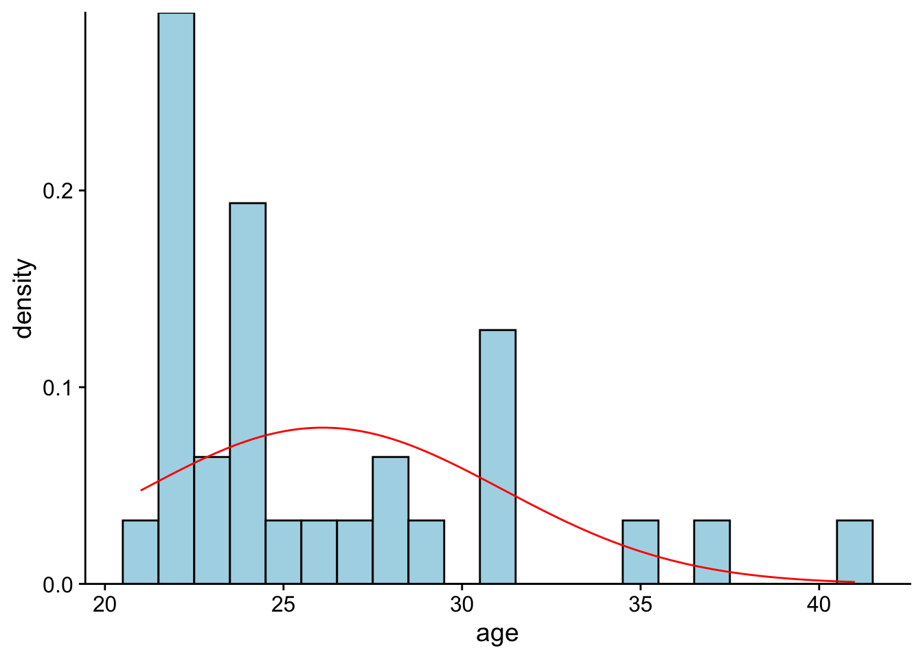
We can add vertical lines to the previous plot, indicating the mean (red line), median (orange line), and mode (yellow line) values using geom_vline():
classAgesPlot +
  # mean is a red line
  geom_vline(xintercept=mean(cohorts$age),
             color="red",
             size = 1.5) +
  # median is a blue line
  geom_vline(xintercept=median(cohorts$age),
             color="orange",
             linetype="solid",
             size = 1.5) +
  # mode is an orange line
  geom_vline(xintercept=DescTools::Mode(cohorts$age),
             color="yellow",
             size = 1.5)
Warning: Using `size` aesthetic for lines was deprecated in ggplot2 3.4.0.
ℹ Please use `linewidth` instead.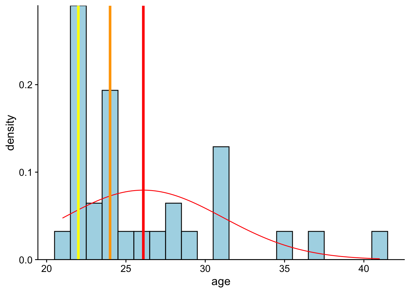
So the mode has the highest probability. But that doesn’t mean that it is the best starting point to describe this data. Note that the hypothetical density function is centered around the mean. This is because the mean is the best guess for any individual score. Let’s see this in action.
Comparing the mean to the mode, first let’s ask ourselves How far would you be off on a person by person basis if you guessed their age to be the mode?:
class_ages_mode <- DescTools::Mode(cohorts$age)
cohorts$age - class_ages_mode
[1] 19 9 9 -1 13 9 0 0 0 2 3 9 1 0 0 1 0 15 6 2 0 5 0 2 4
[26] 0 2 6 2 7 2The sum of this error:
sum(cohorts$age - class_ages_mode) %>% round()[1] 127Okay, now assume you chose the mean:
class_ages_mean <- mean(cohorts$age)
cohorts$age - class_ages_mean
[1] 14.90322581 4.90322581 4.90322581 -5.09677419 8.90322581 4.90322581
[7] -4.09677419 -4.09677419 -4.09677419 -2.09677419 -1.09677419 4.90322581
[13] -3.09677419 -4.09677419 -4.09677419 -3.09677419 -4.09677419 10.90322581
[19] 1.90322581 -2.09677419 -4.09677419 0.90322581 -4.09677419 -2.09677419
[25] -0.09677419 -4.09677419 -2.09677419 1.90322581 -2.09677419 2.90322581
[31] -2.09677419sum(cohorts$age - class_ages_mean) %>% round()[1] 0The summed error of the mean is much less than then mode. In fact it’s going to be less than any other value—its going to be zero!
10.3 mean as fulcrum point
The next two sections involve a little bit of complex coding that will be rehearsed in future workshops. For now I have two goals, to:
- demonstrate the mean produces the least amount of summed error and
- by virtue of that minimized the sum-of-squared differences, or SS.
The latter is arguably more important as SS is used to calculate variability and is most directly used in assessing inferential models.
This week we also described the mean as the balance point for our data—that the sum of all deviation scores from the mean = 0: \(\sum{X-\bar{X}} = 0\). That is, the mean values produces the least amount of summed error, 0.
Imagine that you are encountering someone in class and are asked to guess their age (and WIN! WIN! WIN!). The only info that you have is the range of our ages:
range(cohorts$age)[1] 21 41In what follows, I’m going to iterate through each possible age (guess) within our range and get the sum of difference scores, or sumDiff. sumDiff is obtained by subtracting each age from a given value. Typically this value is the mean. For example say I guessed 27:
# 1. guessed age:
guess <- 27
# 2. resulting difference scores, squared
diffScores <- (ages-guess)
# 3. the sum of squares:
sumDiff <- sum(diffScores)

# 4. show the sumDiff (example)
show(sumDiff)
[1] -28Then the sum of my difference scores (errors) would be -28.
Now, I’m going to iterate through every possible age in the range, and save the resulting sumDiffs to a vector, sumDiffguess. It might be good for you to check to output on a line-by-line basis here.
# create a vector of all possible integers within our range:
rangeAges <- min(cohorts$age):max(cohorts$age)

# create an empty vector to save our resulting sum of differences
sumDiffguess <- vector()
guessedAge <- vector()

# here "i" indexes which value from the range to pull, for example when i=1, we are pulling the first number in the sequence
for(i in 1:length(rangeAges)){
  guess <- rangeAges[i]
  diffScores <- (ages-guess)
  sumDiff <- sum(diffScores)

  # save results to sumDiffguess
  guessedAge[i] <- guess
  sumDiffguess[i] <- sumDiff
}

diffAges_df <- tibble(guessedAge,sumDiffguess) #combine the two vectors to single data frame
diffAges_df
# A tibble: 21 × 2
guessedAge sumDiffguess
<int> <dbl>
1 21 158
2 22 127
3 23 96
4 24 65
5 25 34
6 26 3
7 27 -28
8 28 -59
9 29 -90
10 30 -121
# ℹ 11 more rowsNow let’s plot the resulting sum of difference scores as a function of guessed age. The vertical blue line represents mean age. As you can see this is where our function crosses 0 on the y-axis (thick red line). This is the point where the sum of difference scores is 0.
# note I did this all in one step:

sumDiffPlot <- ggplot2::ggplot(data = diffAges_df,
                               aes(x=guessedAge,
                                   y=sumDiffguess)) +
  geom_point() +
  geom_line() +
  geom_vline(xintercept=mean(cohorts$age), # using actual ages from
             color="blue", size = 1) +
  geom_hline(yintercept=0, color = "red", size=3)+
  theme_minimal()


sumDiffPlot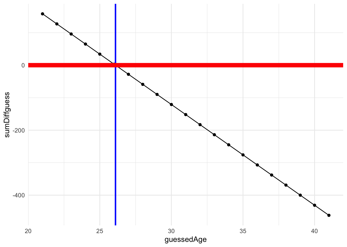
10.4 mean as minimizing random error
Of course, in our statistics the sum of squared-differences (or SS) \(\sum{(X-\bar{X})^2}\) is our primary measure rather than the sum of difference in the last example. SS is used to calculate variance \(\frac{\sum{(X-\bar{X})^2}}{N-1}\) and in turn standard deviation, which is just the square root of the variance. Both measures we use to describe variability in a distribution of data. When we know nothing about our data we assume that the scores, and therefore the resulting difference or error from the mean is randomly distributed. Hence the term random error.
First, let’s calculate the resulting SS for each possible guess (similar to above):
# create a vector of all possible integers within our range:
rangeAges <- min(cohorts$age):max(cohorts$age)

# create an empty vector to save our resulting sum of differences
SSguess <- vector()
guessedAge <- vector()

# here "i" indexes which value from the range to pull, for example when i=1, we are pulling the first number in the sequence
for(i in 1:length(rangeAges)){
  guess <- rangeAges[i]
  diffScores <- (ages-guess)
  SSDiff <- sum(diffScores^2)
  # save SS to SSguess
  guessedAge[i] <- guess
  SSguess[i] <- SSDiff
}

SS_Ages_df <- tibble(guessedAge,SSguess) #combine the two vectors to single data frame
show(SS_Ages_df)
# A tibble: 21 × 2
guessedAge SSguess
<int> <dbl>
1 21 1562
2 22 1277
3 23 1054
4 24 893
5 25 794
6 26 757
7 27 782
8 28 869
9 29 1018
10 30 1229
# ℹ 11 more rowsNow, let’s see what happens when we plot the resulting SS as a function of guessed age:
SS_Plot <- ggplot2::ggplot(data = SS_Ages_df,
                           aes(x=guessedAge,
                               y=SSguess)) +
  geom_point() +
  geom_smooth(color = "black") +
  geom_vline(xintercept=mean(cohorts$age), # using actual ages from
             color="red",
             size=2) +
  theme_minimal()


SS_Plot
`geom_smooth()` using method = 'loess' and formula = 'y ~ x'
As you can see we get parabola with a minima at our mean, again indicating that the mean is the best guess for any individual score. This is because the mean produces the least amount of summed error, or SS.
10.5 but we can do better than that
The mean is good as a stab in the dark, but as you can see our SS is still high.
# minimum value of SSguess is the SS about the mean
min(SS_Ages_df$SSguess)
[1] 757If we have other useful information about the nature of our age data, then maybe we can use that to make better predictions. These extra bits of info are our predictors. For example, let’s combine our age data with info on how many years everyone has been out of undergraduate. For the purposes of this example, I’m just going to make this data up (sort one, some of this may be true).
Let’s create a vector of years since UG:
yearsUG <- c(17,8,7,1,15,12,1,2,3,2,5,10,4,2,6,4,3,15,5,2,1,3,1,4,2,1,3,4,4,5,3)Lets combine yearsUG to our cohorts data frame:
cohorts <- cohorts %>% mutate("yearsUG" = yearsUG)and create a scatterplot (geom_point) of age as a function of yearsUG:
ggplot2::ggplot(cohorts, aes(x=yearsUG,y=ages)) + geom_point()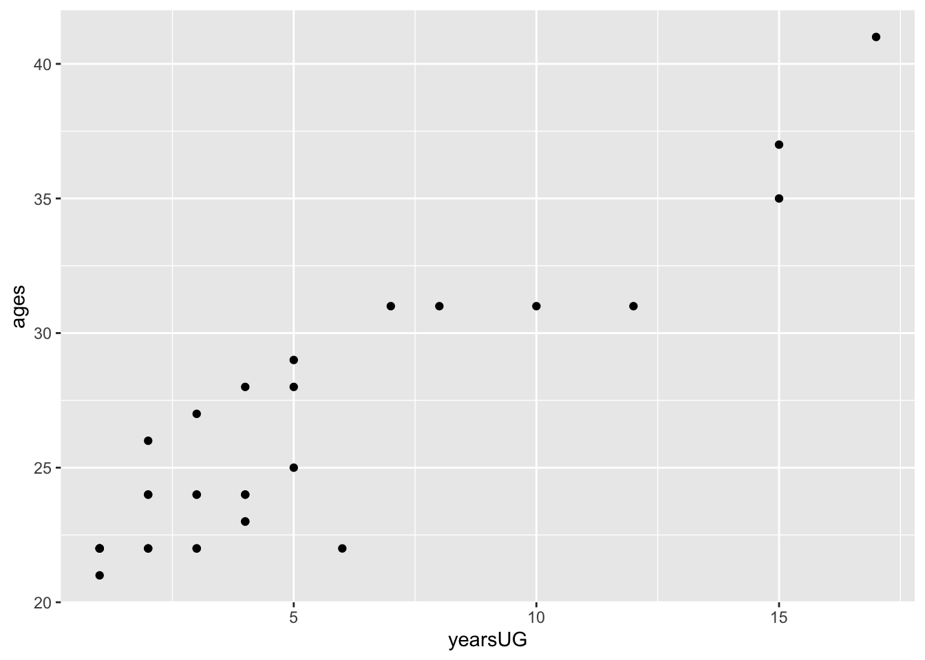
Keeping in mind that our focus this semester will be in linear models. As a simplification, this means that we are looking for an equation of the line that best fits our data (minimizes the resulting SS). The equation for the line that represents the mean would be:
\[\hat{Y} = mean\ age + 0 * yearsUG\]
This means years since undergrad does not figure into the mean model (it gets multiplied by zero. This results in a horizontal line with mean age as the y-intercept. We would define this model as “predicting age (\(\hat{Y}\)) as a function of the mean age of the distribution.
This is still a couple weeks out, but in R we would run this model, aka the means_model, as:
means_model <- lm(formula = ages~1,data = cohorts)and we can add the regression line (means_fitted) for this model to our the previous plot. Note that the dotted vertical lines (in red) represent the residuals—the differences between what the model predicts and actual data:
# add the predicteds and residuals from the means model to our cohorts dataframe:
cohorts <- cohorts %>% mutate(means_fitted = means_model$fitted.values,
                                means_resids = means_model$residuals)


ggplot2::ggplot(cohorts, aes(x=ages,y=ages)) +
  geom_point() + # add actual data points
  geom_line(aes(y = means_fitted), color = "blue") + # Add the predicted values
  geom_segment(aes(xend = ages, yend = means_fitted), color="red", linetype="dotted")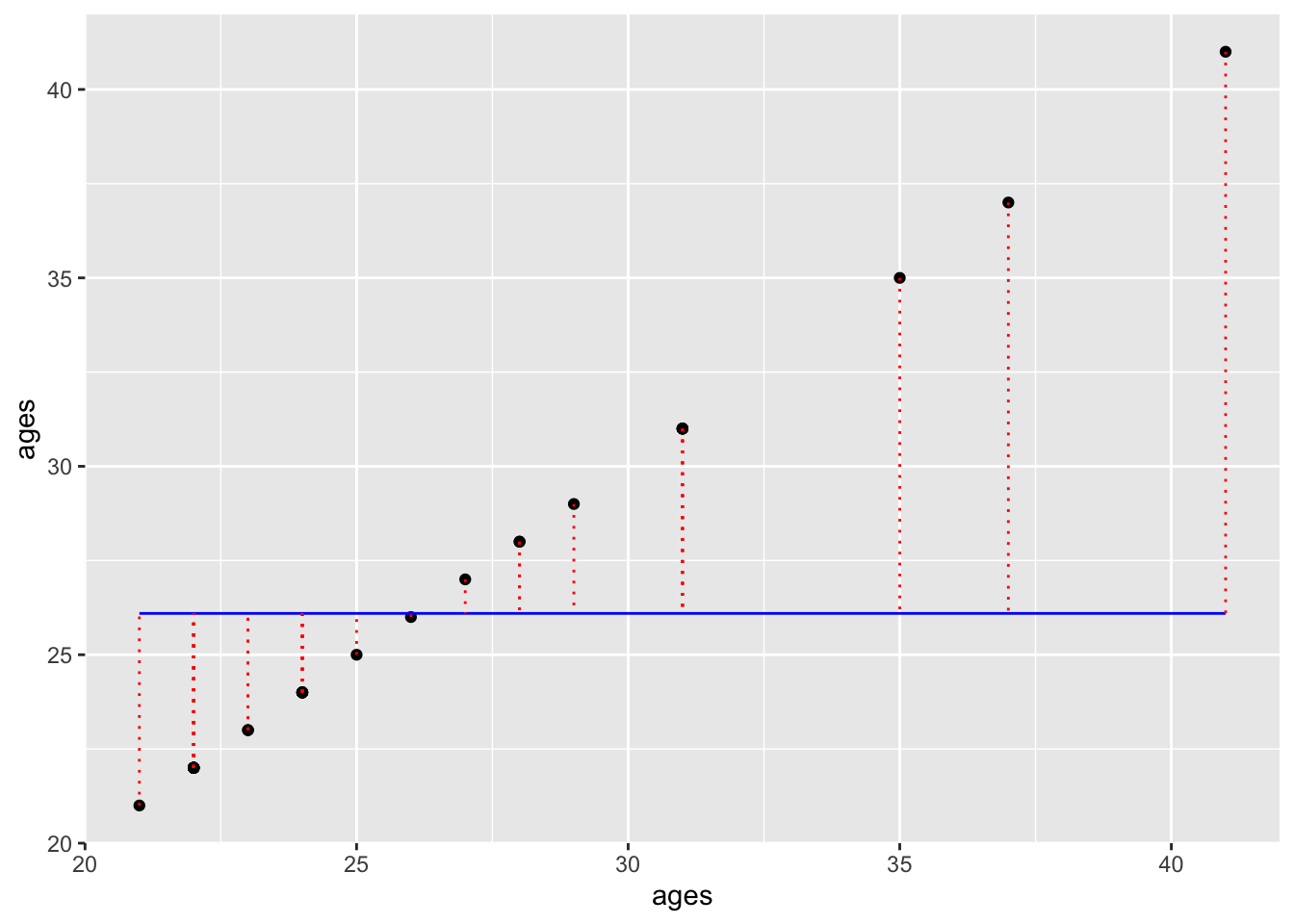
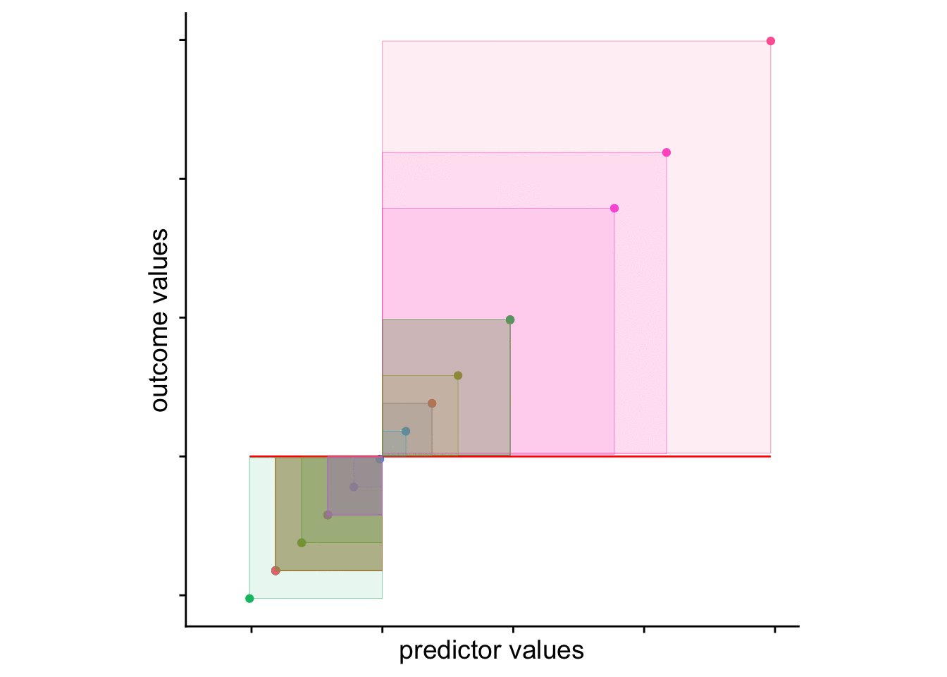
The squared sum of the length of those dotted lines is your…. wait for it Sum of Squares!!!. We can visualize this value by adding squares to our plot. The area of each square is the squared residual. The sum of the area of all squares is the SS. The larger the SS, the more error in our model.
# define squares for means model
cohorts <-
  cohorts %>%
  mutate(mean_xmin = age,
         mean_xmax = age-means_resids,
         mean_ymin = age,
         mean_ymax = age-means_resids)

# plot
ggplot2::ggplot(cohorts, aes(x=ages,y=ages, col = person)) +
  geom_point() + # add actual data points
  geom_line(aes(y = means_fitted), color = "red") + # Add the predicted values
  geom_tile(aes(x = age-means_resids/2,
                y = age-means_resids/2,
                height = means_resids,
                width = means_resids,
                fill = person), alpha = .1) +
  theme_cowplot() +
theme(aspect.ratio=1, legend.position = "none") + ylim(c(20,45)) 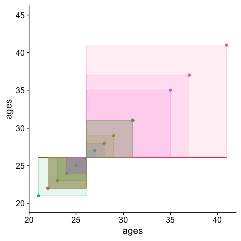
Now lets compare this to a model predicting age as a function of years since undergrad yearsUG. In this case our model would be:
years_model <- lm(formula = ages~yearsUG, data = cohorts)And we can add the regression line and residuals like above:
# add the predicteds and residuals from the years model to our df:
cohorts <- cohorts %>% mutate(years_fitted = years_model$fitted.values,
                                years_resids = years_model$residuals)

ggplot2::ggplot(cohorts, aes(x=yearsUG,y=ages)) +
  geom_point() + # add actual data points
  geom_line(aes(y = years_fitted), color = "blue") + # Add the predicted values
  geom_segment(aes(xend = yearsUG, yend = years_fitted), color="red", linetype="dotted")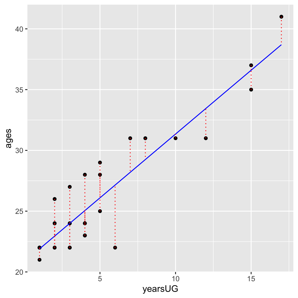
and again visualize the squared residuals:
cohorts <-
  cohorts %>%
  mutate(years_xmin = age,
         years_xmax = age-years_resids,
         years_ymin = age,
         years_ymax = age-years_resids)

ggplot2::ggplot(cohorts, aes(x=yearsUG,y=ages, col = person)) +
  geom_point() + # add actual data points
  geom_line(aes(y = years_fitted), color = "red") + # Add the predicted values
  geom_tile(aes(x = yearsUG-years_resids/2,
                y = age-years_resids/2,
                height = years_resids,
                width = years_resids,
                fill = person), alpha = .1) +
  theme_cowplot() +
  theme(aspect.ratio=1, legend.position = "none") + ylim(c(20,45))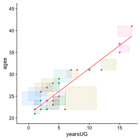
Those residuals have shrunk quite a bit. Indeed comparing the two values:
tibble("means_model_SS"=cohorts$means_resids^2 %>% sum(), #sum of squares
       "years_model_SS"=cohorts$years_resids^2 %>% sum() #sum of squares
) %>% gt()| means_model_SS | years_model_SS |
|---|---|
| 756.7097 | 115.2647 |
and looking at the two plots side-by-side:
means_model_plot <-
  ggplot2::ggplot(cohorts, aes(x=ages,y=ages, col = person)) +
  geom_point() + # add actual data points
  geom_line(aes(y = means_fitted), color = "red", size = 2) + # Add the predicted values
  geom_tile(aes(x = age-means_resids/2,
                y = age-means_resids/2,
                height = means_resids,
                width = means_resids,
                fill = person), alpha = .1) +
  theme_cowplot() +
  theme(aspect.ratio=1, legend.position = "none", axis.text.x = element_blank()) + xlab("predictor: mean")

years_model_plot <-
  ggplot2::ggplot(cohorts, aes(x=yearsUG,y=ages, col = person)) +
  geom_point() + # add actual data points
  geom_line(aes(y = years_fitted), color = "red", size = 2) + # Add the predicted values
  geom_tile(aes(x = yearsUG-years_resids/2,
                y = age-years_resids/2,
                height = years_resids,
                width = years_resids,
                fill = person), alpha = .1) +
  theme_cowplot() +
  theme(aspect.ratio=1, legend.position = "none", axis.text.x = element_blank()) + xlab("predictor: mean + years UG")

cowplot::plot_grid(means_model_plot,years_model_plot)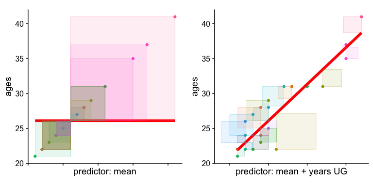
And finally an animation to drive the point home (note that the axes here are scaled):
10.6 looking forward
As you may have intuited the lm in the above call stands for “linear model”. Congrats, you just plotted a linear regression!!!!
What’s important here is that from a visual inspection the yearsUG model provides a better fit. Why, because it’s reduced the resulting difference scores (of SS). The sum of the squared distances from each point to the regression line with yearsUG as a predictor is less than the regression model with the mean as the only predictor. This is what we mean by “accounting for variance”. The yearsUG model accounts for more variance than the means model. Why? Because it reduces the SS.
This sort of comparison (between a means_model and a means+predictors model is the backbone of many of the tests you will perform this semester. Indeed in a few weeks when we say that the “regression is significant” or that the “F-ratio for the ANOVA is significant” this is essentially the comparison that we are making!!!
Of course, a critical question that we strive to answer with our statistical tests (like the F-test) is whether the model using additional predictors accounts for more variance above a critical threshold that it may be deemed significant, or unlikely due to chance. This is something that will become critically important in a few weeks. For now, if you can wrap your head around this walkthrough, then you’ve got an intuitive understanding of almost every test we will run this semester.