pacman::p_load(psych, tidyverse, cowplot, emmeans, ez)43 Template for Analysis & APA Style
In this section, I want to take everything we have highlighted in the previous two walkthroughs and lay out a template for ANOVA. Think of this as ANOVA in 9 easy steps. FWIW I also have a video link posted on CANVAS that invites you to do a problem with me in real time that reiterates much of what’s covered here. This walkthrough in many ways mirrors that video and is nearly identical to the qmd that accompanies the video (all of which is to say if you’re a more visual person, the video may be the way to go).
43.1 Step 0: Loading in the packages
43.2 Step 1: Data wrangling
import your data
is the data in the right format?
do you need to make any adjustments to the data frame?
library(readr)
dataset <- read_csv("http://tehrandav.is/courses/statistics/practice_datasets/factorial_ANOVA_dataset_no_interactions.csv")
Rows: 36 Columns: 4
── Column specification ────────────────────────────────────────────────────────
Delimiter: ","
chr (2): Lecture, Presentation
dbl (2): Score, PartID
ℹ Use `spec()` to retrieve the full column specification for this data.
ℹ Specify the column types or set `show_col_types = FALSE` to quiet this message.# unnecessary here, but if performing planned contrasts you need to factorize predictors (IVs)
dataset$Presentation <- as.factor(dataset$Presentation)
dataset$Lecture <- as.factor(dataset$Lecture)
dataset# A tibble: 36 × 4
Lecture Presentation Score PartID
<fct> <fct> <dbl> <dbl>
1 Phys Comp 53 1
2 Phys Comp 49 2
3 Phys Comp 47 3
4 Phys Comp 42 4
5 Phys Comp 51 5
6 Phys Comp 34 6
7 Phys Stand 44 7
8 Phys Stand 48 8
9 Phys Stand 35 9
10 Phys Stand 18 10
# ℹ 26 more rows- In this case the data looks to be in the correct format (long). Since I am not doing planned contrasts I don’t need to worry about factorizing my IV columns.
43.3 Step 2: Look at your data
- plot the data: I like to do histograms by condition as well as a means plot (interaction plot) and a participant number grid to get a feel for what my distribution of scores looks like. (Note I’m not using this to make decisions on my data model assumptions!)
ggplot(data = dataset, aes(x = Score)) +
    geom_histogram(fill = "gray", color = "black") +
    facet_grid(rows = vars(Lecture), cols = vars(Presentation))
`stat_bin()` using `bins = 30`. Pick better value with `binwidth`.
I also take a quick glance at the means of my groups (interaction plot)
ggplot(data = dataset, aes(x = Lecture, y = Score, group = Presentation, color = Presentation)) +
    stat_summary(fun.data = "mean_se",
                 geom = "pointrange") +
    stat_summary(fun = "mean",
                 geom = "line",
                 lty="solid")
And finally I take a look at the number of participants in each group (cell) to ensure that my design is roughly balanced.
ez::ezDesign(dataset, x = Lecture, y = Presentation)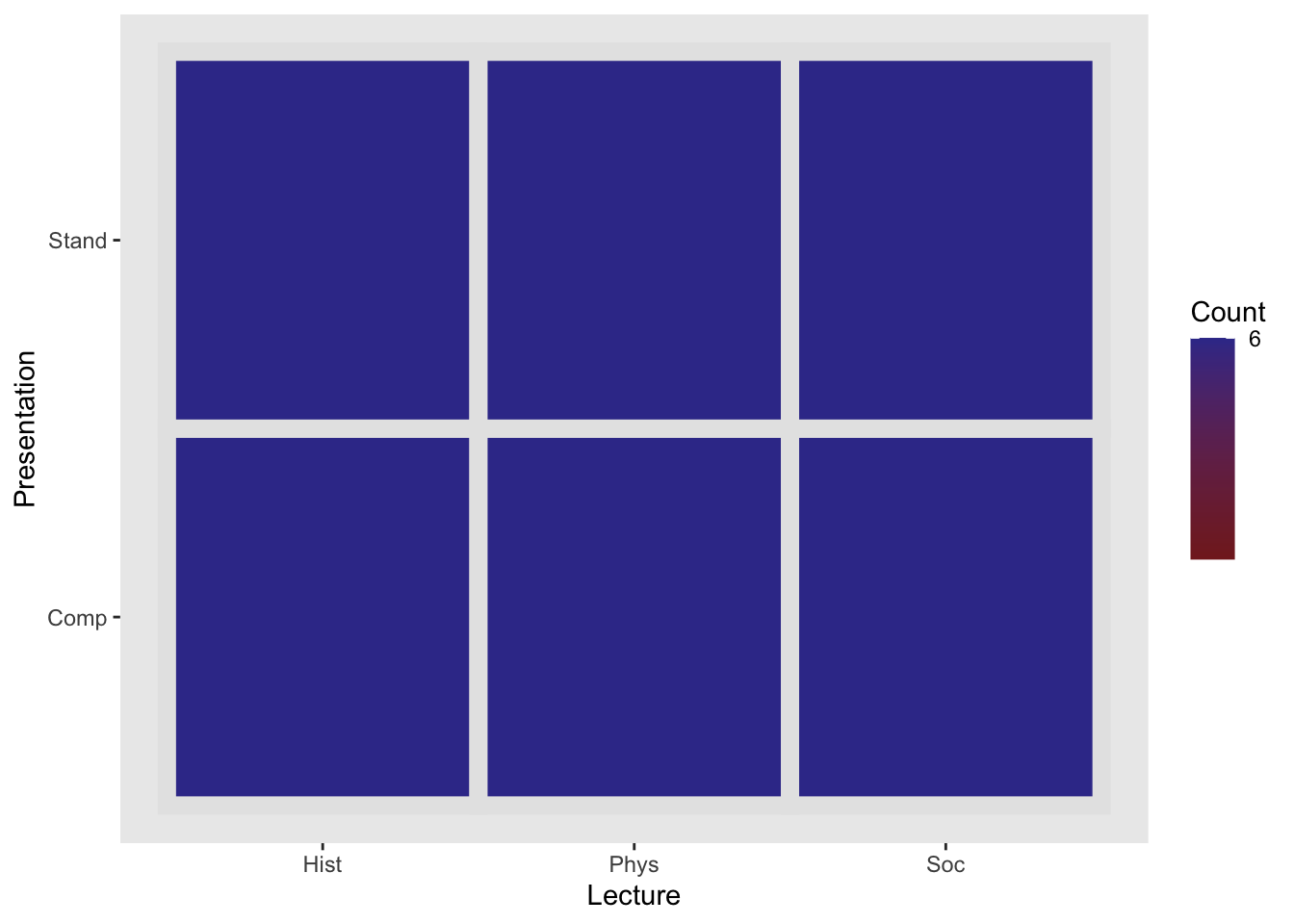
43.4 Step 3: Build your model
build the ANOVA model
note that this week we are only focusing on the additive model.
# additive model (this week)
aov_model <- lm(Score~Lecture + Presentation, data = dataset)
43.5 Step 4: Check your model assumptions
- check the model assumptions (normality and homogeneity)
# visual:
aov_model %>% performance::check_model(panel = FALSE)

# test of normality (this is the Shapiro Test):
aov_model %>% performance::check_normality()
OK: residuals appear as normally distributed (p = 0.887).# test of homogeneity
aov_model %>% performance::check_homogeneity()Warning: Variances differ between groups (Bartlett Test, p = 0.040).Note: that if you wanted to check normality using the bootstrapping method from the video, there is a mistake (I forgot an important step). FWIW, this would be better than Shapiro-test but it’s much more involved
# note that if you wanted to check normality using the bootstrapping method from the video, these is a mistake (I forgot an important step).

# 1. build a distribution of skews (note that because this is random, your values won't equal mine):
distribution_skews <- DescTools::Skew(x = aov_model$residuals,
                ci.type = "bca",
                method = 2,
                conf.level = 0.95,
                R = 1000)
# 2. calculate the standard error:
standard_error_of_skews <- (distribution_skews[3]-distribution_skews[2])/3.92

# 3. take obtained skew and divide by standard_error_of_skews
psych::skew(aov_model$residuals) / standard_error_of_skews %>%
  unname()
[1] 0.6835753# 4. compare this value against critical values from Kim (2013) method, repeat for kurtosis
# ----- OR ------- use my custom function that handles all of the above
source("http://tehrandav.is/courses/statistics/custom_functions/skew_kurtosis_z.R")
aov_model$residuals %>% skew_kurtosis_z() upr.ci crit_vals
skew_z 0.70 1.96
kurt_z -0.02 1.9643.5.1 SUMMARY:
- Test of normality and homogeneity don’t suggest troublesome any violations
43.6 Step 5: Run the analysis (ANOVA)
pacman::p_load(sjstats)
sjstats::anova_stats(aov_model)[1:8]
term | df | sumsq | meansq | statistic | p.value | etasq | partial.etasq
-------------------------------------------------------------------------------------
Lecture | 2 | 416.222 | 208.111 | 3.779 | 0.034 | 0.121 | 0.191
Presentation | 1 | 1248.444 | 1248.444 | 22.670 | < .001 | 0.364 | 0.415
Residuals | 32 | 1762.222 | 55.069 | | | | 43.6.1 SUMMARY
- Main effect Lecture: F(2, 30) = 3.83, p = .03, np2 = .20
- Main effect Presentation: F(1, 30) = 22.96, p < .001, np2 = .43
- remember that since this is a factorial ANOVA I report my partial eta square for effect size.
43.7 Step 6: Run additional tests based what your ANOVA outcomes
deal with the ANOVA outcomes ONE AT A TIME!!!
simple effects ANOVA (if there is an interaction… more on this next week)
post hoc analyses
or if you have planned contrasts run those here
make a quick summary of each result
- include any relevant means or tests (t-tests, p vals, etc)
Here we are performing posthocs. We’ll have two sets (although for now the post hoc test on Presentation is redundant.
43.7.1 Post hoc analysis for Lecture
emmeans(aov_model, spec = ~Lecture) %>% pairs(adjust = "tukey") contrast estimate SE df t.ratio p.value
Hist - Phys -5.50 3.03 32 -1.815 0.1807
Hist - Soc 2.67 3.03 32 0.880 0.6565
Phys - Soc 8.17 3.03 32 2.696 0.0291
Results are averaged over the levels of: Presentation
P value adjustment: tukey method for comparing a family of 3 estimates 43.7.1.1 SUMMARY
- tukeys suggests difference between Phys and Social t(30) = 2.71, p = .029
- Phys > Soc
43.7.2 Post hoc analysis for Presentation
emmeans(aov_model, spec = ~Presentation) %>% pairs(adjust = "tukey") contrast estimate SE df t.ratio p.value
Comp - Stand 11.8 2.47 32 4.761 <.0001
Results are averaged over the levels of: Lecture 43.7.2.1 SUMMARY
- tukeys suggests difference between Comp and Stand
- Comp > Stand
- t(30) = 4.792, p < .001
43.8 Step 7: Create a camera ready plot
I really go into detail with this in the 3rd video (see CANVAS). For now, a few considerations:
publication plots by default need to be in black/white/grayscale
the legend needs to fit within the axes of the plot
when plotting multiple factors on a single plot, its useful to differentiate data series by
shape,fill,color, orlinetypedepending on the plot. Sometimes its best to use these aesthetics in combination with one another.Include a figure caption in the text below the plot output.
For example:
# lecture on x-axis, score on y-axis, data groups by presentation:
ggplot(data = dataset, aes(x = Lecture, y = Score, group = Presentation)) +
    # pointrange (mean ± se) with different shapes by presentation type:
    stat_summary(fun.data = "mean_se",
                 geom = "pointrange",
                 aes(shape = Presentation),
                 size = 1) +
  # add lines (means), with different linetypes by presentation
    stat_summary(fun = "mean",
                 geom = "line",
                 aes(linetype = Presentation)) +
  # theme cowplot gets us a quick APA
    theme_cowplot() +
  # custom labels to make my axes convey more information
  # if you con't include this the axis just contain the headers (Lecture, Presentation)
    labs(y="Test Score", x = "Lecture Subject") +
  # adjusting the location of the legend:
    theme(legend.position = c(.05,.9))
Figure 1. Test scores as a function of subject of lecture and presentation type. Errors bars are standard error
43.9 Step 8: write ups
you can perform a write up in Word (or you word processor of choice)
or you can do a write-up in Rstudio
- you can use Markdown and MathJax (LaTeX) to do this.
Before starting, let’s get our summary statistics (mean and standard errors) to include in the write up.
Lecture:
Rmisc::summarySE(dataset, measurevar = "Score", groupvars = "Lecture") Lecture N Score sd se ci
1 Hist 12 34.50000 8.393721 2.423058 5.333116
2 Phys 12 40.00000 10.795622 3.116428 6.859211
3 Soc 12 31.83333 9.311121 2.687889 5.916004Presentation
Rmisc::summarySE(dataset, measurevar = "Score", groupvars = "Presentation") Presentation N Score sd se ci
1 Comp 18 41.33333 6.249706 1.473070 3.107906
2 Stand 18 29.55556 9.438483 2.224672 4.693647Taking these summary statistics in addition to the ANOVA table summary I outlined above, I can perform a detailed write up. Be sure to include
all tests run (ANOVA, post hocs, and their appropriate statistics
information about group means and standard errors.
explicitly refer to the Figure.
This should follow a logical flow; in this case after presenting the general ANOVA, focus on post-hocs for one main effect and explain that info completely before moving onto the other.
For example:
We submitted our data to a 2 (Presentation) x 3 (Lecture) Analysis of Variance. Our ANOVA revealed a significant main effect for Presentation, \(F\)(1, 30) = 22.96, \(p\) < .001, \(\eta_p^2\) = .43. Scores for groups given the computer presentation (\(M ± SE\): 41.33 ± 1.47) were greater than scores for the standard presentation (29.56 ± 2.22).Our ANOVA revealed a significant main effect for Lecture, \(F\)(2, 30) = 3.83, \(p\) = .03, \(\eta_p^2\) = .20. Post hoc Tukey pairwise analysis revealed that the mean score of participants in the Physical (40.00 ± 3.12) group was greater than the score of the Social group (30.83 ± 2.69), \(t\)(30) = 2.71, \(p\) = .029. See Figure 1 for group comparisons.